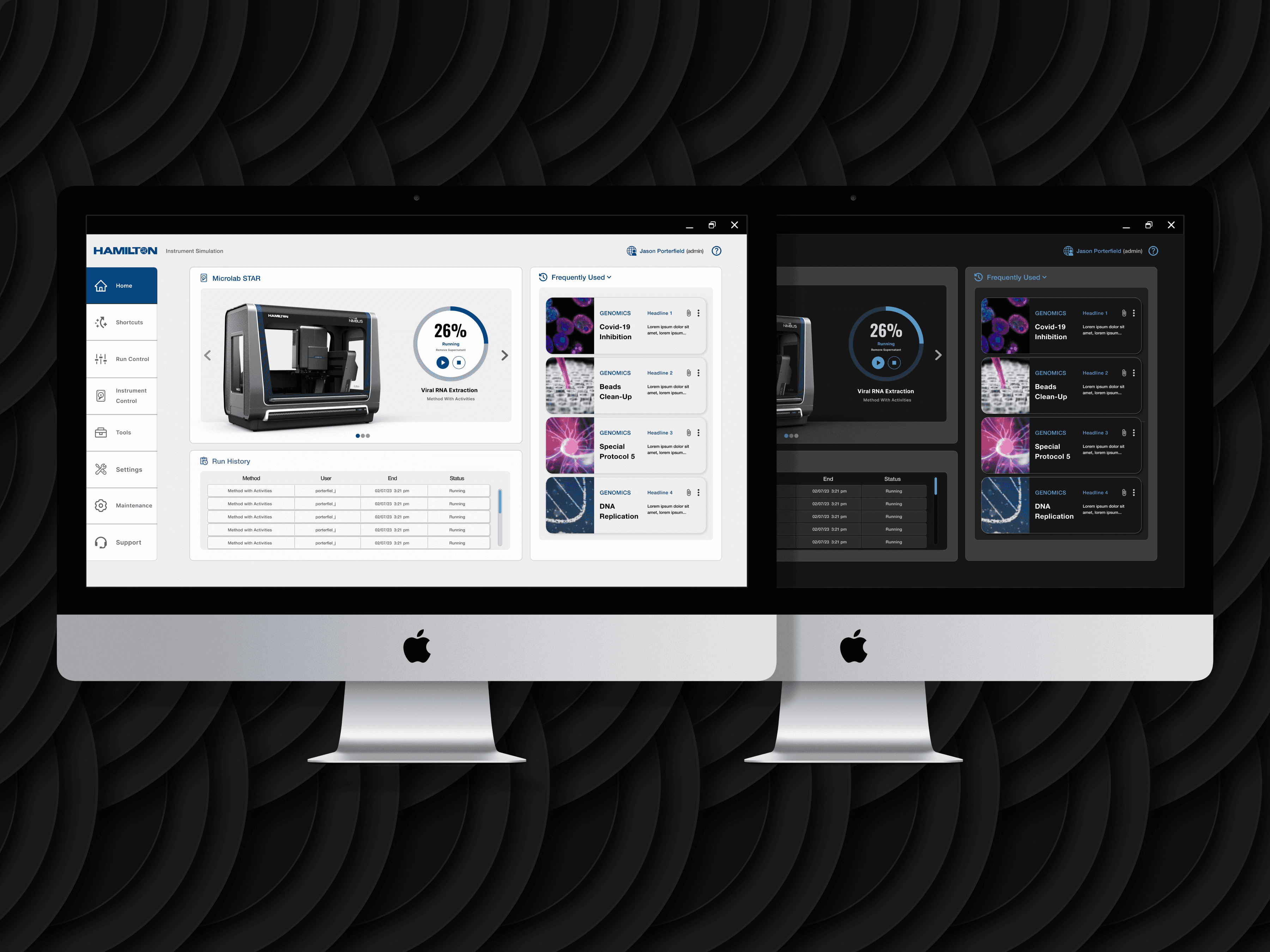
Hamilton Company | UI & Design System Reimagined
New and reimagined UI to bring an enhanced & unified user experience across interfaces, on Hamilton's common software platform.
New and reimagined UI to bring an enhanced & unified user experience across interfaces, on Hamilton's common software platform.
New and reimagined UI to bring an enhanced & unified user experience across interfaces, on Hamilton's common software platform.


Client
Hamilton Company
Year
2022-2023


Role
UX/UI
On Behalf of RKS Design
Services
UI Design
Visual Design
Development
Interaction Design
Branding
Design Systems
Design
Graphic Design

Tools
Adobe Illustrator
Adobe Photoshop
Figma
Microsoft Office
Zoom
Project Info

Client
Hamilton Company
Year
2022-2023

Role
UX/UI
On Behalf of RKS Design
Services
UI Design
Visual Design
Interaction Design
Branding
Design Systems Design
Graphic Design

Tools
Adobe Illustrator
Adobe Photoshop
Figma
Microsoft Office
Zoom
From
Discovery,
to
Delivery.


From Discovery,
to
Delivery.


Project Info
Project Info

Client
Hamilton
Company
Year
2022-2023

Role
UX/UI
On Behalf of RKS Design
Services
UI Design
Visual Design
Interaction Design
Branding
Design Systems
Design
Graphic Design

Tools
Adobe Illustrator
Adobe Photoshop
Figma
Microsoft Office
Zoom
From
Discovery,
to
Delivery.


Project Summary
Project Summary
Project Summary
Hamilton Company sought out RKS Design to unify and modernize the look and feel of their common software platform. The project began with research and design efforts led by RKS project management and the brand designer, which resulted in a single dashboard view (in light and dark variants) that was approved by the client. This marked the beginning of my scope of work as the visual designer for the project.
I worked with a common software platform that had unique interfaces
Hamilton Company sought out RKS Design to unify and modernize the look and feel of their common software platform. The project began with research and design efforts led by RKS project management and the brand designer, which resulted in a single dashboard view (in light and dark variants) that was approved by the client. This marked the beginning of my scope of work as the visual designer for the project.
I worked with a common software platform that had unique interfaces across web, WPF, and legacy applications. I iterated on the early design direction screen to create both new and redesigned views with a unified feel, dark and light mode variants, prioritized iconography, and the flexibility to be used with touch interfaces. Through a series of sprints with stakeholders and engineering teams, I delivered a handoff file of 60+ screens, a modernized design system and set of components, as well as innovative user flows and functionality that were not previously imagined.
across web, WPF, and legacy applications. I iterated on the early design direction screen to create both new and redesigned views with a unified feel, dark and light mode variants, prioritized iconography, and the flexibility to be used with touch interfaces. Through a series of sprints with stakeholders and engineering teams, I delivered a handoff file of 60+ screens, a modernized design system and set of components, as well as innovative user flows and functionality that were not previously imagined.
Hamilton Company sought out RKS Design to unify and modernize the look and feel of their common software platform. The project began with research and design efforts led by RKS project management and the brand designer, which resulted in a single dashboard view (in light and dark variants) that was approved by the client. This marked the beginning of my scope of work as the visual designer for the project.
I worked with a common software platform that had unique interfaces across web, WPF, and legacy applications. I iterated on the early design direction screen to create both new and redesigned views with a unified feel, dark and light mode variants, prioritized iconography, and the flexibility to be used with touch interfaces. Through a series of sprints with stakeholders and engineering teams, I delivered a handoff file of 60+ screens, a modernized design system and set of components, as well as innovative user flows and functionality that were not previously imagined.


Project Goals
Project Goals
My Tasks
- Iterate on the early design direction screen to create both new and redesigned views with a unified feel.
- Create dark and light mode variants of all screens.
- Prioritize iconography and make sure it is accessible to all users.
- Design the software platform to be flexible and easy to use with touch interfaces.
- Collaborate with stakeholders and engineering teams to ensure that the designs meet their needs.
Project Goals
- Unify and modernize the look and feel of Hamilton Company's common software platform.
- Create a design system and set of components that can be used across all platforms.
- Improve the usability and accessibility of the software platform.
- Unify and modernize the look and feel of Hamilton Company's common software platform.
- Create a design system and set of components that can be used across all platforms.
- Improve the usability and accessibility of the software platform.
- Unify and modernize the look and feel of Hamilton Company's common software platform.
- Create a design system and set of components that can be used across all platforms.
- Improve the usability and accessibility of the software platform.
My Tasks
My Tasks
- Iterate on the early design direction screen to create both new and redesigned views with a unified feel.
- Create dark and light mode variants of all screens.
- Prioritize iconography and make sure it is accessible to all users.
- Design the software platform to be flexible and easy to use with touch interfaces.
- Collaborate with stakeholders and engineering teams to ensure that the designs meet their needs.


Key Accomplishments
- Delivered a handoff file of 60+ screens that were approved by the client.
- Created a modernized design system and set of components that can be used across all platforms.
- Improved the usability and accessibility of the software platform.
- Introduced innovative user flows and functionality that were not previously imagined.
Benefits to Clients
- A more unified and modern look and feel that will improve brand recognition.
- A more user-friendly and accessible software platform that will improve productivity.
- A design system and set of components that can be used to save time and money on future projects.
- Innovative user flows and functionality that will give the client a competitive edge.
Key Accomplishments
Key Accomplishments
- Delivered a handoff file of 60+ screens that were approved by the client.
- Created a modernized design system and set of components that can be used across all platforms.
- Improved the usability and accessibility of the software platform.
- Introduced innovative user flows and functionality that were not previously imagined.
Benefits to Clients
Benefits to Clients
- A more unified and modern look and feel that will improve brand recognition.
- A more user-friendly and accessible software platform that will improve productivity.
- A design system and set of components that can be used to save time and money on future projects.
- Innovative user flows and functionality that will give the client a competitive edge.
Visual Highlights
Visual Highlights
Visual Highlights


